NICO SÁNCHEZ

Address

Ferrara, Italy

Email

contatto@nicosanchez.it

Phone

(+39) 331 410 4169

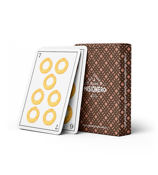
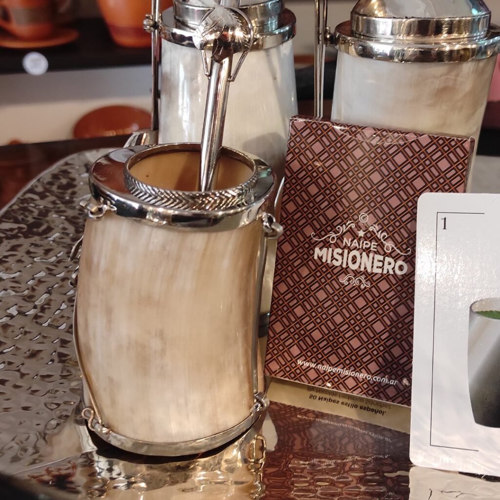
Naipe Misionero© is a limited-edition card game featuring 50 cards that celebrate the rich culture of Misiones Province, Argentina. I created the game in 2022, and it was officially declared of Provincial Interest by the Misiones House of Representatives that same year.

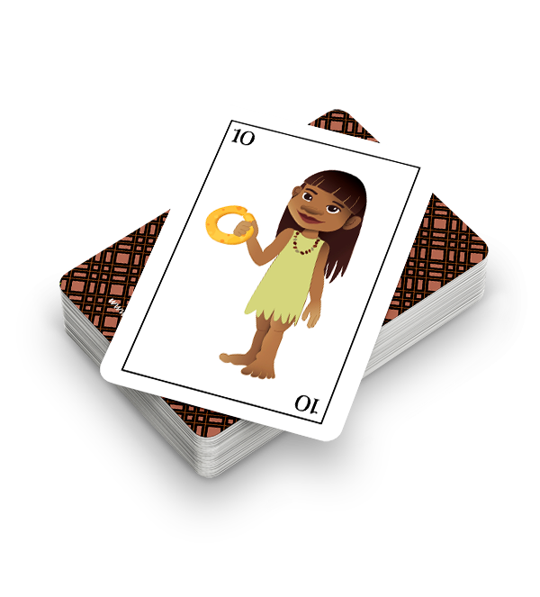
Naipe Misionero© is more than just a game — it’s a journey through the traditions, myths, and stories of one of Argentina’s most vibrant cultures. Each card is carefully illustrated to depict iconic elements of our tierra colorada (red soil land): from tereré and chipa to indigenous peoples, the yaguaraté, and legendary folk characters like El Pombero and Jasy Jateré.

In this deck, the Cups are represented by tereré, Coins by chipa, Swords by the bow and arrow, and Clubs by the traditional slingshot (gomera).
The face cards (10, 11, and 12) feature Guaraní indigenous characters, with a Cacique (chief) replacing the King, and a Yaguaraté (jaguar) instead of the traditional Horse. 🃏
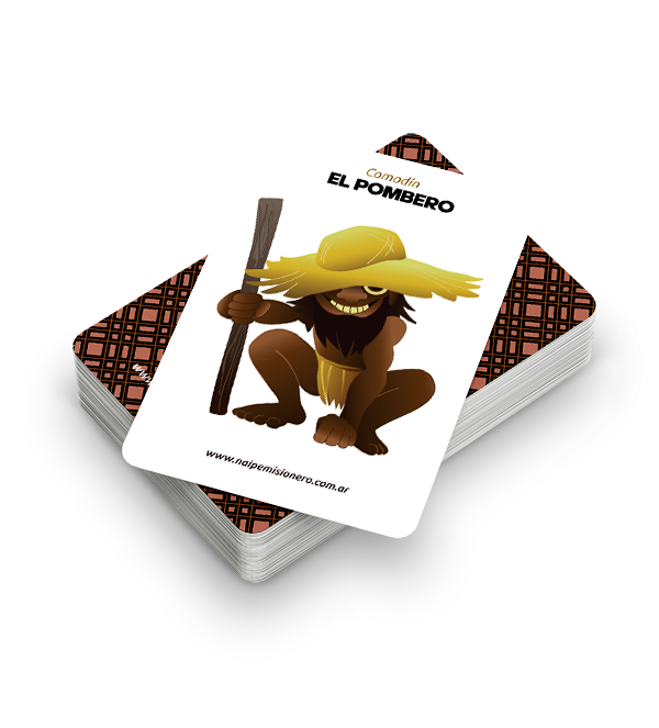
Our jokers spotlight two of the most important mythological legends of the region: El Pombero and Jasy Jateré (Yasy Yataré).

Up next, you’ll see the equivalent card in its Spanish version.

Naipe Misionero© proved that design can be a powerful tool to highlight local cultures and create impact beyond borders. This project became more than just a card game — it turned into a symbol of identity and pride for an entire community.

Our game has captured the attention of numerous provincial and national media outlets.
Below, we share some of the interviews we’ve been featured in ❤️

By Nico Sanchez

Eunicorner

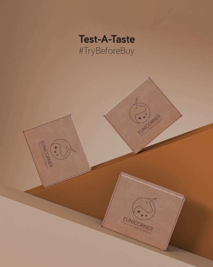
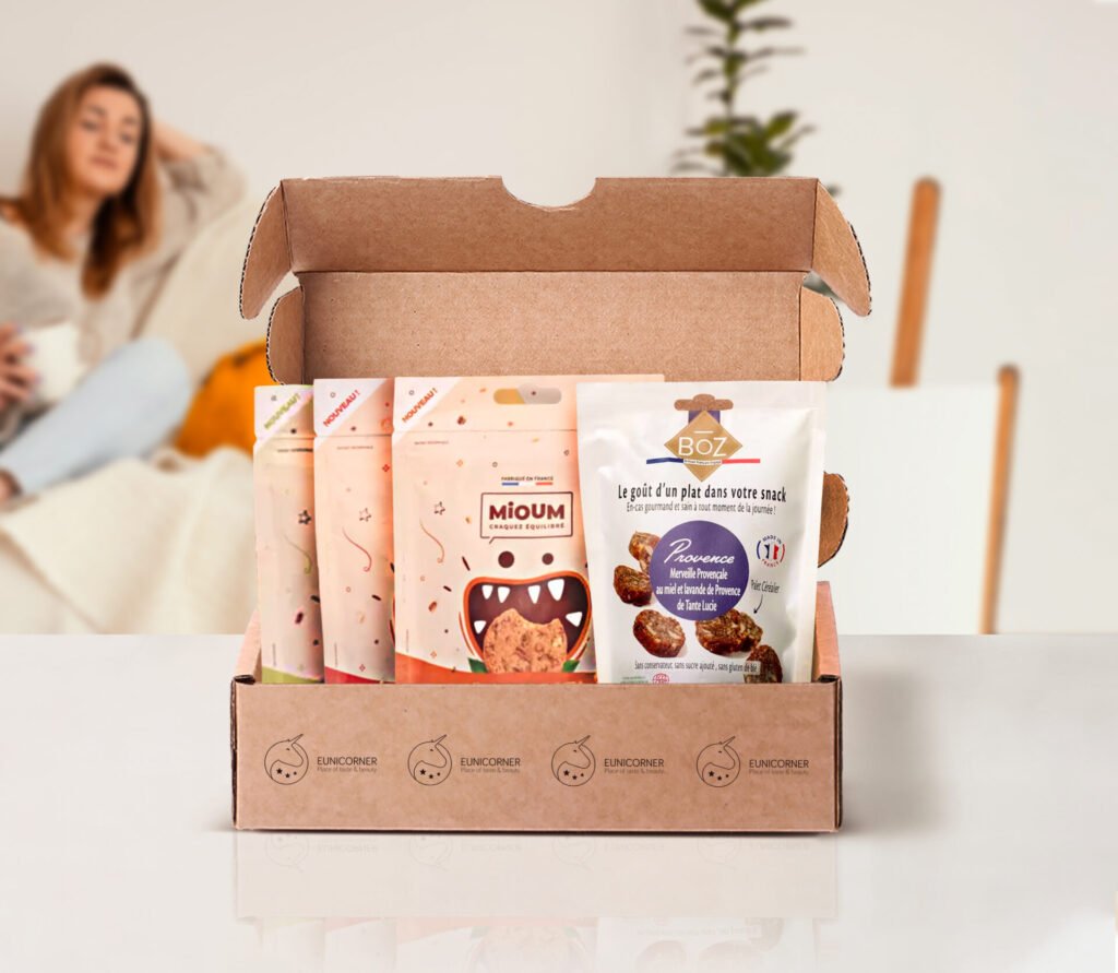
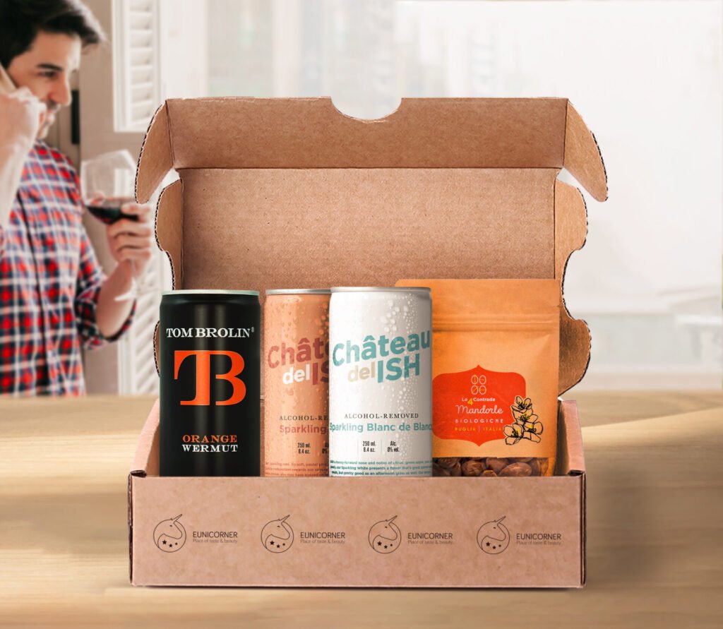
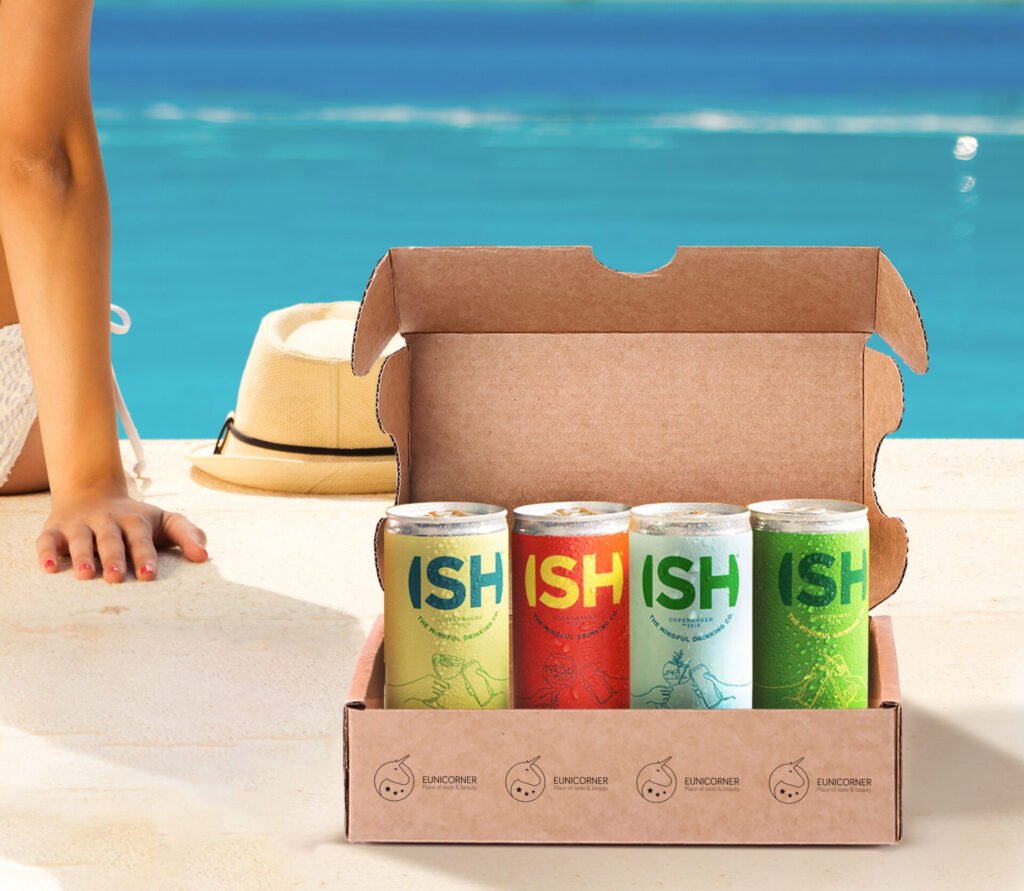
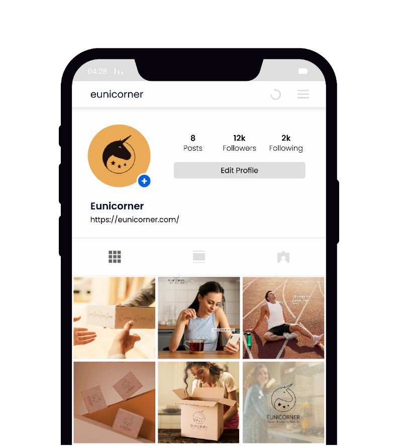
Eunicorner is a European project redefining how we discover new snacks and drinks: a curated monthly box filled with fun, sugar-free, alcohol-free surprises.
The challenge was to create a clean, eye-catching visual system aligned with the brand’s focus on health, style, and discovery.

From art direction and product photography to packaging and campaign visuals, the design language strikes a balance between minimalism and strong brand identity.
Each box keeps visual consistency while offering a fresh and memorable experience for both e-commerce and crowdfunding audiences.

This creative pun refers to the place where the business is based (EU = European Union), to the specialness of the products (UNICORN) and to the objective of reaching every corner of the world (CORNER).

To represent this concept, I used the technique of graphic synthesis, a process for reducing and combining visual elements from one or more images.

In this way it maintains its meaning and is even easier to understand, thus improving its clarity and impact. Through this process, we are able to convey a clear message in less time and without the need to be redundant.

What colors to use for a brand that wants to convey originality and quality?

I have carried out a meticulous investigation, to find thechromatic palette that conveys these sensations in the best way.

#211B1B

#D6AD60

#faeace

Characteristics associated with the color brown: feeling of strength and security. Brown looks solid, like earth, and is a color associated with craftsmanship, elegance, exclusivity, and confidence.

Gold is a universal color of infinite charm. With multiple meanings and associations, this stunning hue possesses depth. In most cases, the gold color means prosperity, quality and exclusivity.

The cream color is versatile, it can symbolize humility, sophistication and elegance, as well as reliability and durability.

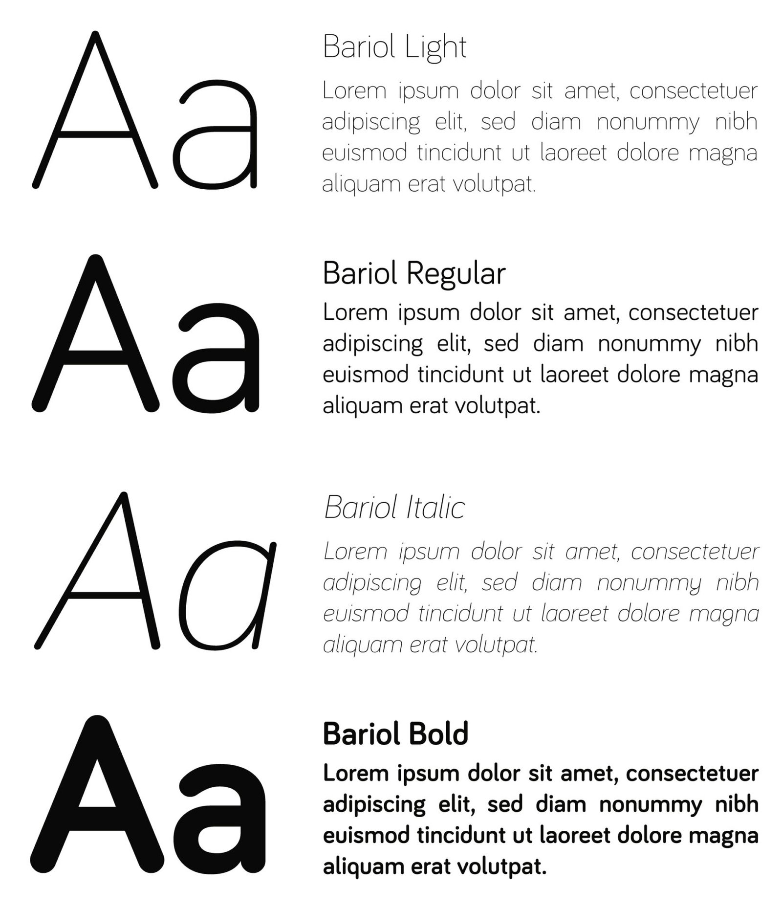
The typographic style must be aligned to the brand. This is why I have selected a rounded font, which follows the curved aspects of the logo. This is how we generate consistency in identity.

By Nico Sánchez

Off-Road
Without
the Shoot

This project was developed for a car dealership in Argentina, with the goal of showcasing the adventurous spirit and toughness of the Ford Raptor in a mountainous setting.

Instead of organizing a full-scale photo shoot on location—which would have involved high logistical costs, permits, transportation, and a full production crew—a more efficient visual solution was chosen: a hyper-realistic montage. Starting from a studio or urban photo of the vehicle, a precise cutout and full integration into a mountain landscape were carried out, with careful attention to detail such as perspective, lighting, shadows, dust effects, and color grading to ensure visual coherence and realism.

Unlike images generated by artificial intelligence, this piece was crafted manually with full creative control over every visual element. This guarantees aesthetic consistency and a directed visual narrative tailored to the client’s message, without relying on algorithmic randomness.

The final result is a striking, ad-quality image that conveys movement, power, and freedom—without incurring the high costs of a real-world production.

By Nico Sánchez

Mr Stevens

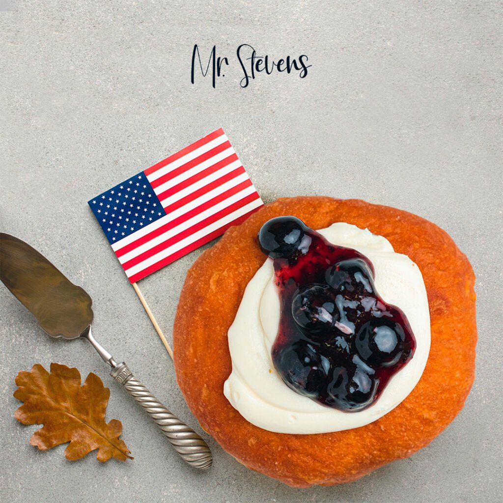
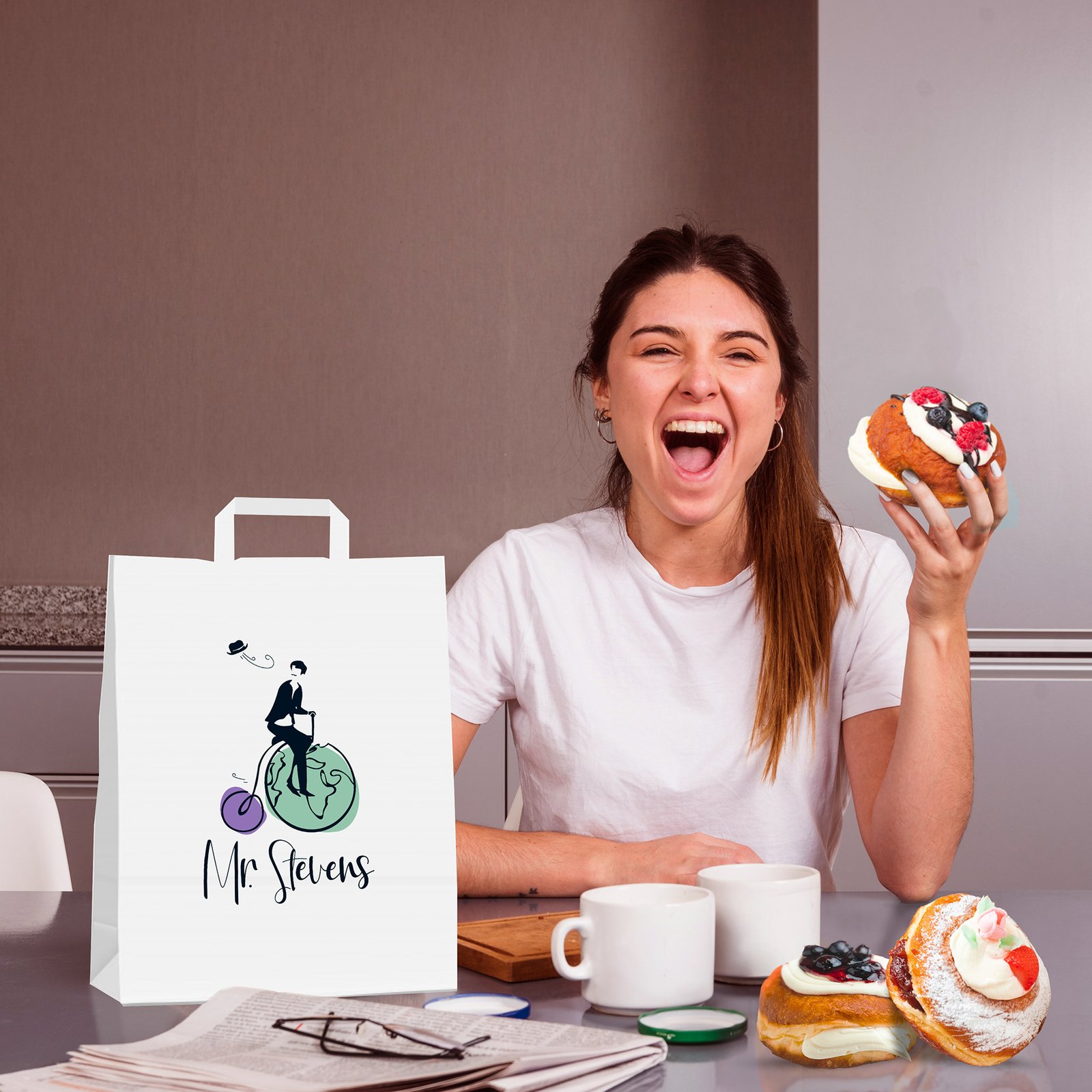
Mr. Stevens is a Madrid-based brand that blends pastry with storytelling and travel. Inspired by a fictional character who explores the world on his bicycle, we developed the visual identity and creative direction for their main product: Wheels — sweet creations that reinterpret traditional desserts from different countries.

For the launch campaign, I produced a series of images where the products were photographed in studio and then fully integrated into lifestyle scenes using digital montage techniques. This approach allowed for rich, contextual storytelling without the need for complex on-location shoots, while keeping the focus on the product and brand aesthetic.

The result is a fresh, international and scalable visual identity that resonates with a young, adventurous audience and adapts perfectly to digital and physical brand applications.

By Nico Sánchez

Pink Rabbit

Visual identity development for Pink Rabbit, a bikini brand with a bold, youthful, and confident style.

The work included logo design, font selection, and a color palette that reinforces the brand’s daring and feminine tone.

To accompany the identity, a reference panel was created using real product images and lifestyle photography, showcasing how the brand looks in context and serving as a visual guide for future content and campaign development.

Nadie es como tú,
y ese es tu poder.

Bariol Font

Aa Bb Cc Ee Ff Gg Hh Ii Jj Kk Ll

Mm Nn Oo Pp Qq Rr Ss Tt Uu Vv

Ww Xx Yy Zz 0 1 2 3 4 5 6 7 8 9 

#FED3DC
254 | 211 | 220

#0D0D0D
13 | 13 | 13

By Nico Sánchez

Grupo Alfonzo

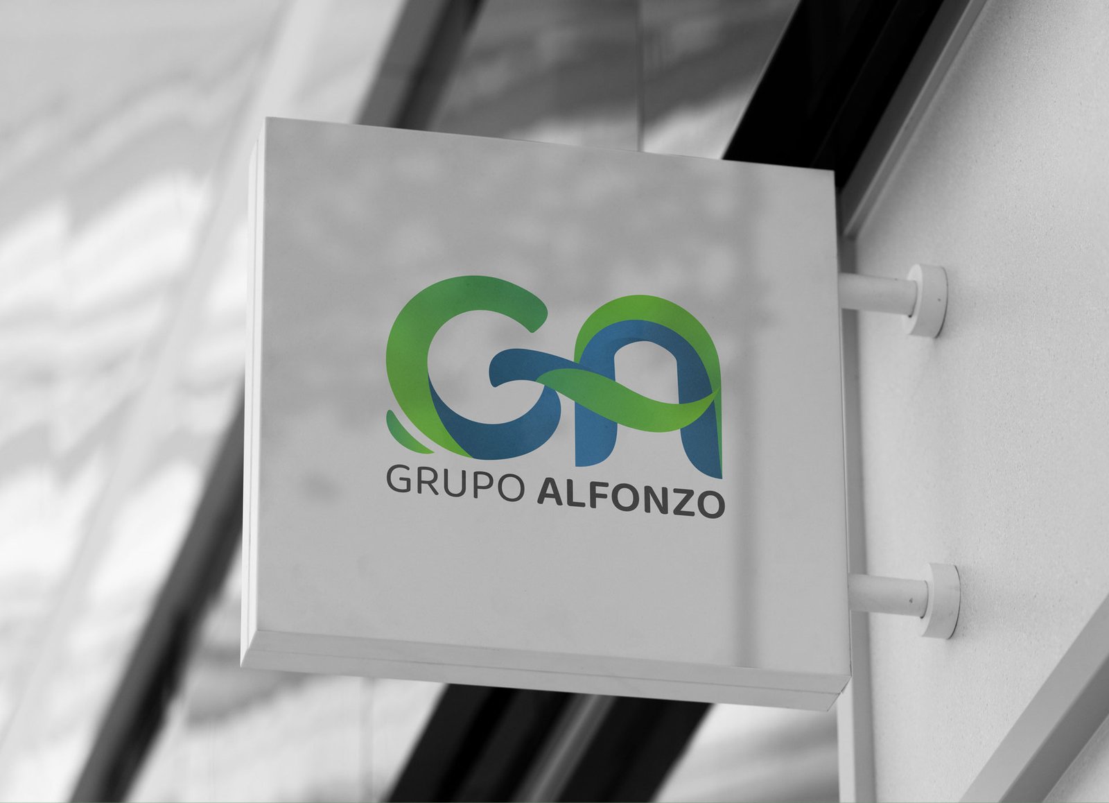
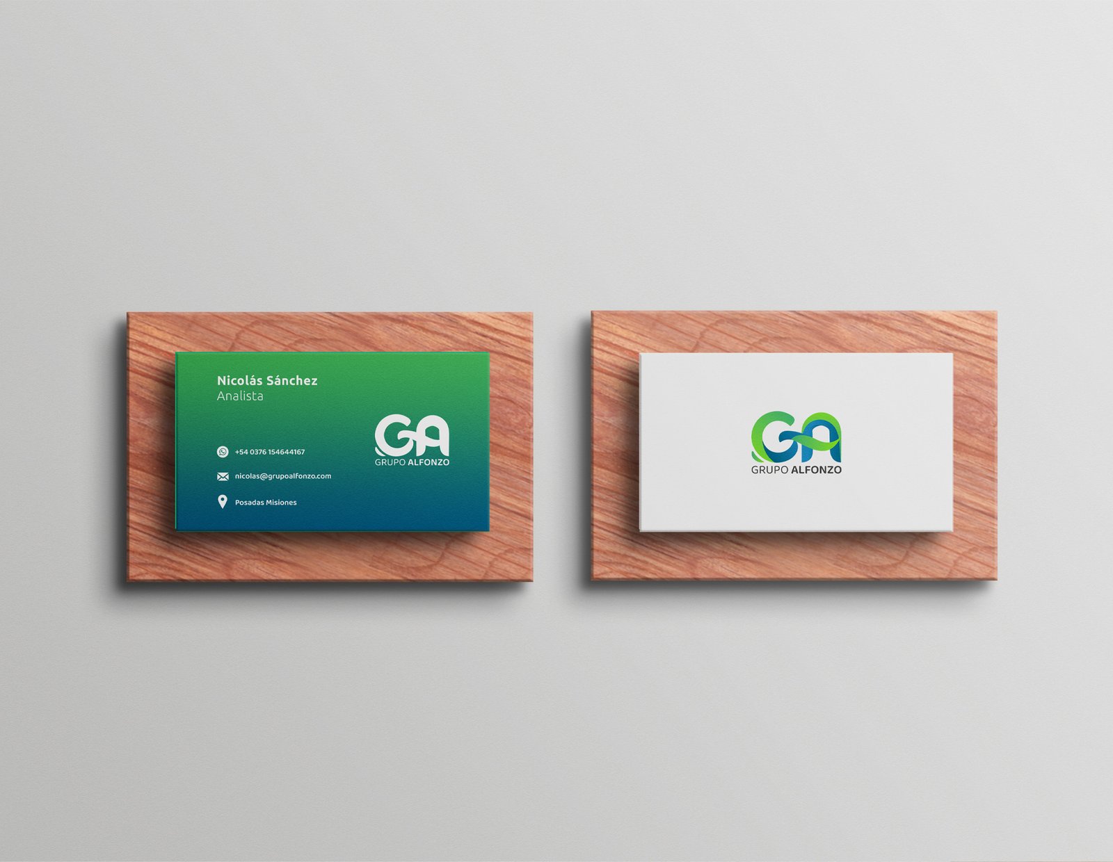
Grupo Alfonzo is a company with multiple business areas that sought to refresh its visual identity with a modern, professional, and flexible design system.
The goal was to create a clear, strong, and adaptable logo that could perform effectively across both digital and physical applications.

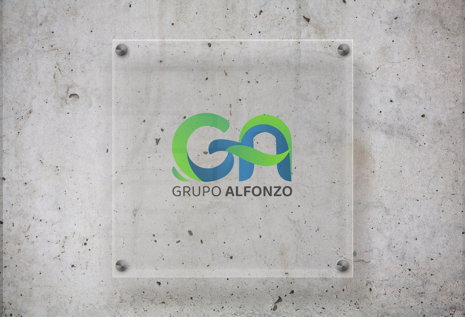
The logo design is built around the initials “GA”, merged in a clean and dynamic composition that conveys unity and growth. The color palette—based on green and blue—reinforces brand values such as trust, stability, and projection.
The identity was applied to stationery, corporate clothing, and signage elements, resulting in a cohesive and scalable brand system.

One identity. Many directions.

Baloo 2 Font

Aa Bb Cc Ee Ff Gg Hh Ii Jj Kk Ll

Mm Nn Oo Pp Qq Rr Ss Tt Uu Vv

Ww Xx Yy Zz 0 1 2 3 4 5 6 7 8 9 

#49b05b
73 | 176 | 91

#6cca3f
108 | 202 | 63

#025b85
2 | 91 | 133

#1177b1
17 | 119 | 177

Growth with purpose.

Smart structure. Solid brand.

By Nico Sánchez

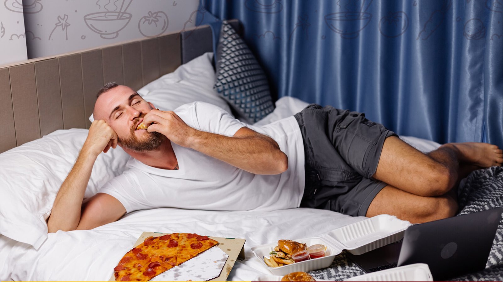
Buscomida

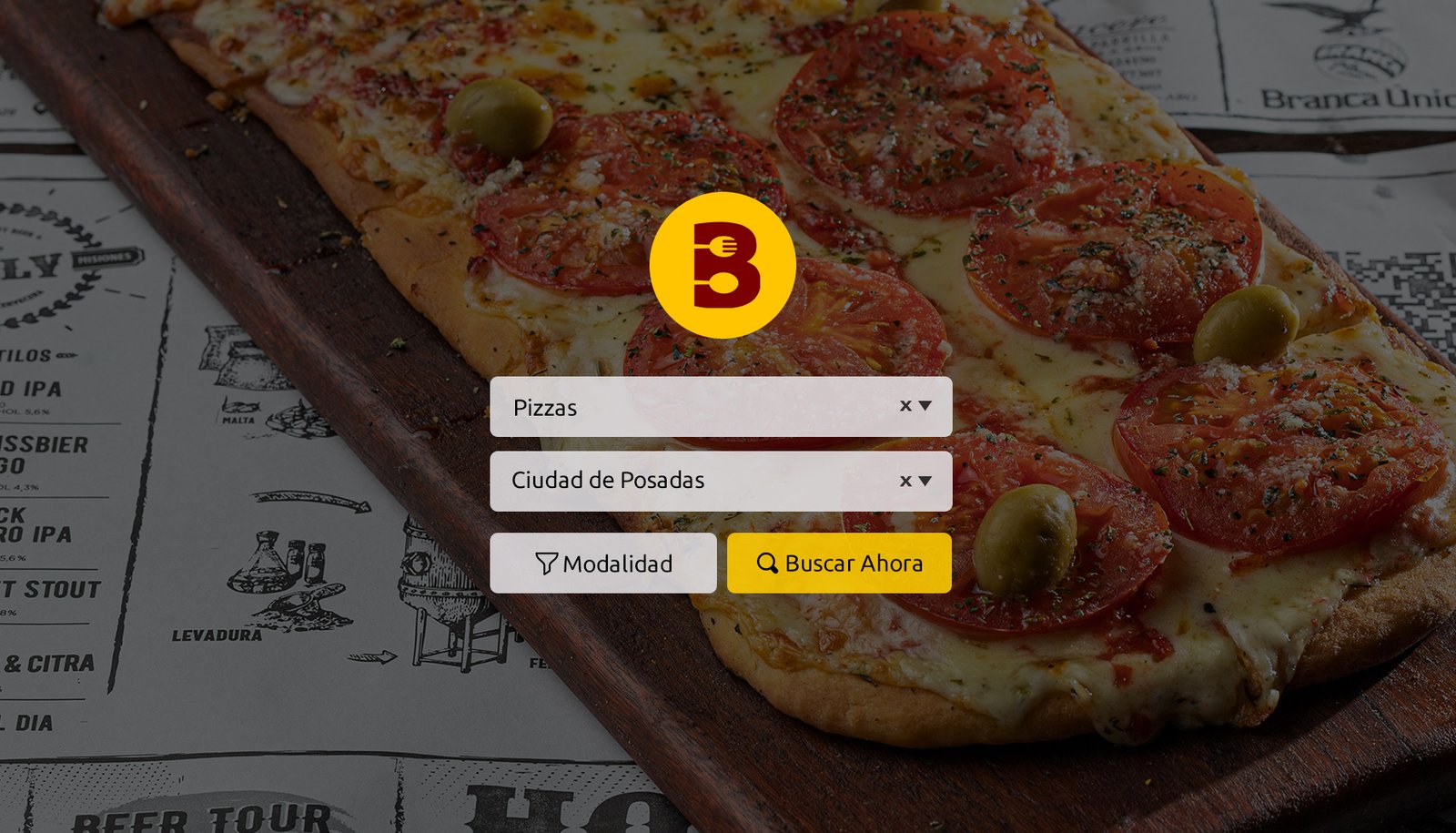
Buscomida is a digital platform designed to connect users with the best nearby food options through a fast, visual, and geolocated experience.

The challenge was to create a modern, intuitive, and responsive interface that enables users to filter, explore, and discover restaurants and dishes based on their location, cuisine type, or personal preferences.

A fresh and friendly visual identity was developed, with a strong focus on user experience. The information architecture, custom icons, and navigation flows were all designed to ensure seamless interaction across devices.

The project included app design, interactive prototypes, reusable components, and a cohesive brand-aligned visual system.

Buscomida connects you with all the food businesses in your city.
It’s easy to use, has no commissions, and doesn’t require registration.

Just choose a place, check the menu, and contact them directly on WhatsApp (no need to save the number). It saves you a lot of time!

Ubuntu Font

Aa Bb Cc Ee Ff Gg Hh Ii Jj Kk Ll

Mm Nn Oo Pp Qq Rr Ss Tt Uu Vv

Ww Xx Yy Zz 0 1 2 3 4 5 6 7 8 9 

#ffc500
255 |197 | 0

#790000
121 | 0 | 0

By Nico Sánchez

Network Traders Club

Network Traders Club is a training and event-based community focused on trading, bringing together financial leaders in high-impact live events.
The goal was to develop a strong and professional visual identity that conveys trust, leadership, and a forward-thinking mindset.

The logo, typefaces, and color palette were crafted to reflect the strength of the financial world combined with the warmth of a growing community. Visual assets were designed for both digital platforms and live events, ensuring brand consistency across all touchpoints.

The result is a bold, modern, and scalable identity that positions Network Traders Club as a key player in the regional trading and financial education scene.

Hagamos historia, juntos.

Oswald Font

Aa Bb Cc Ee Ff Gg Hh Ii Jj Kk Ll

Mm Nn Oo Pp Qq Rr Ss Tt Uu Vv

Ww Xx Yy Zz 0 1 2 3 4 5 6 7 8 9 

#e9f3f4
233 | 243 | 244

#0D0D0D
13 | 13 | 13

By Nico Sánchez

B&B Ca' Bianca

This video was created for Ca’ Bianca, a charming Bed & Breakfast surrounded by nature, perfect for disconnecting and enjoying the peaceful rhythm of northern Italy.

The goal was to capture, from above, the harmony of the landscape, the warmth of the building, and the serenity that makes this place so special.

Through soft, cinematic drone shots, the video conveys the calm, space, and beauty of Ca’ Bianca—inviting viewers to experience it for themselves.

By Nico Sánchez

HogARG

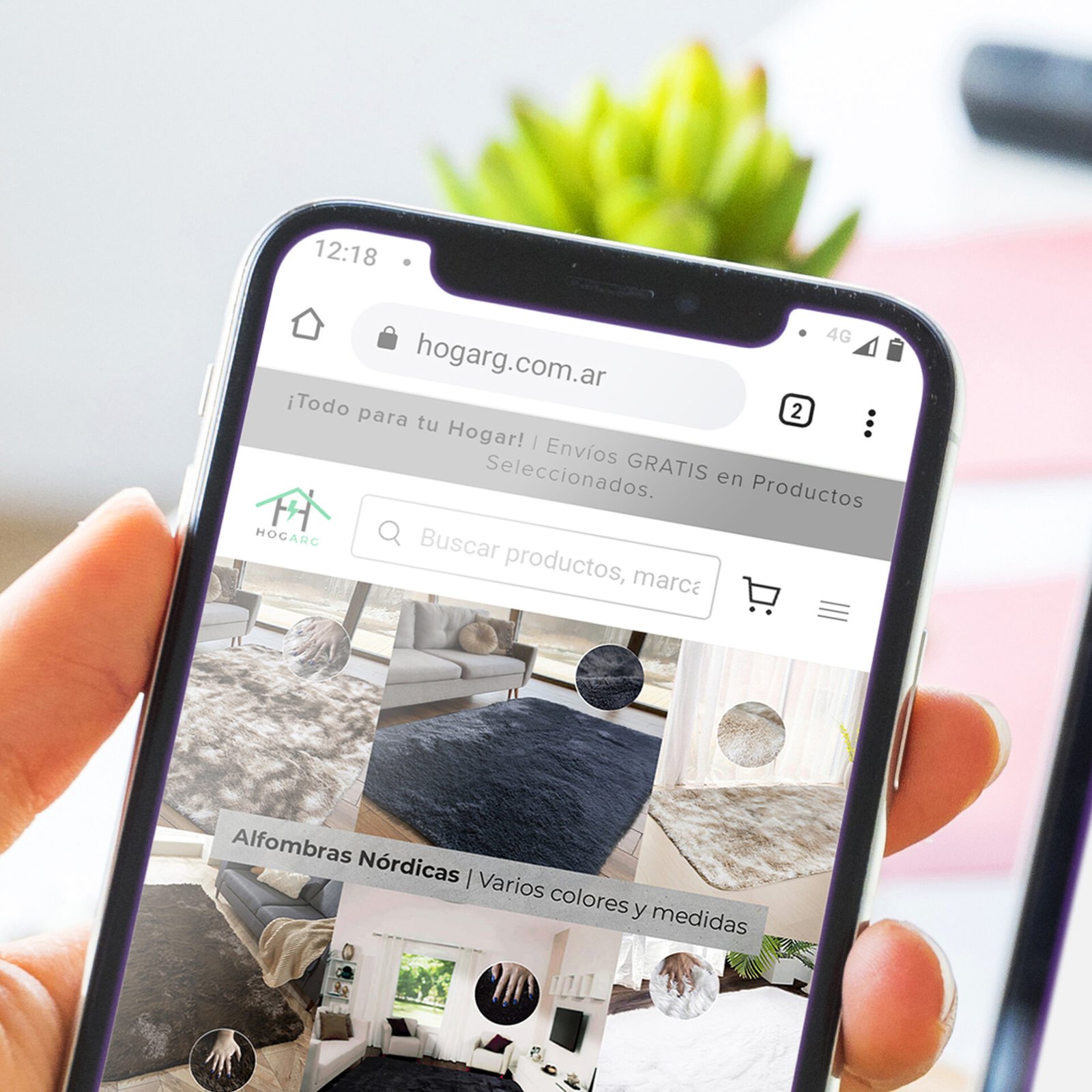
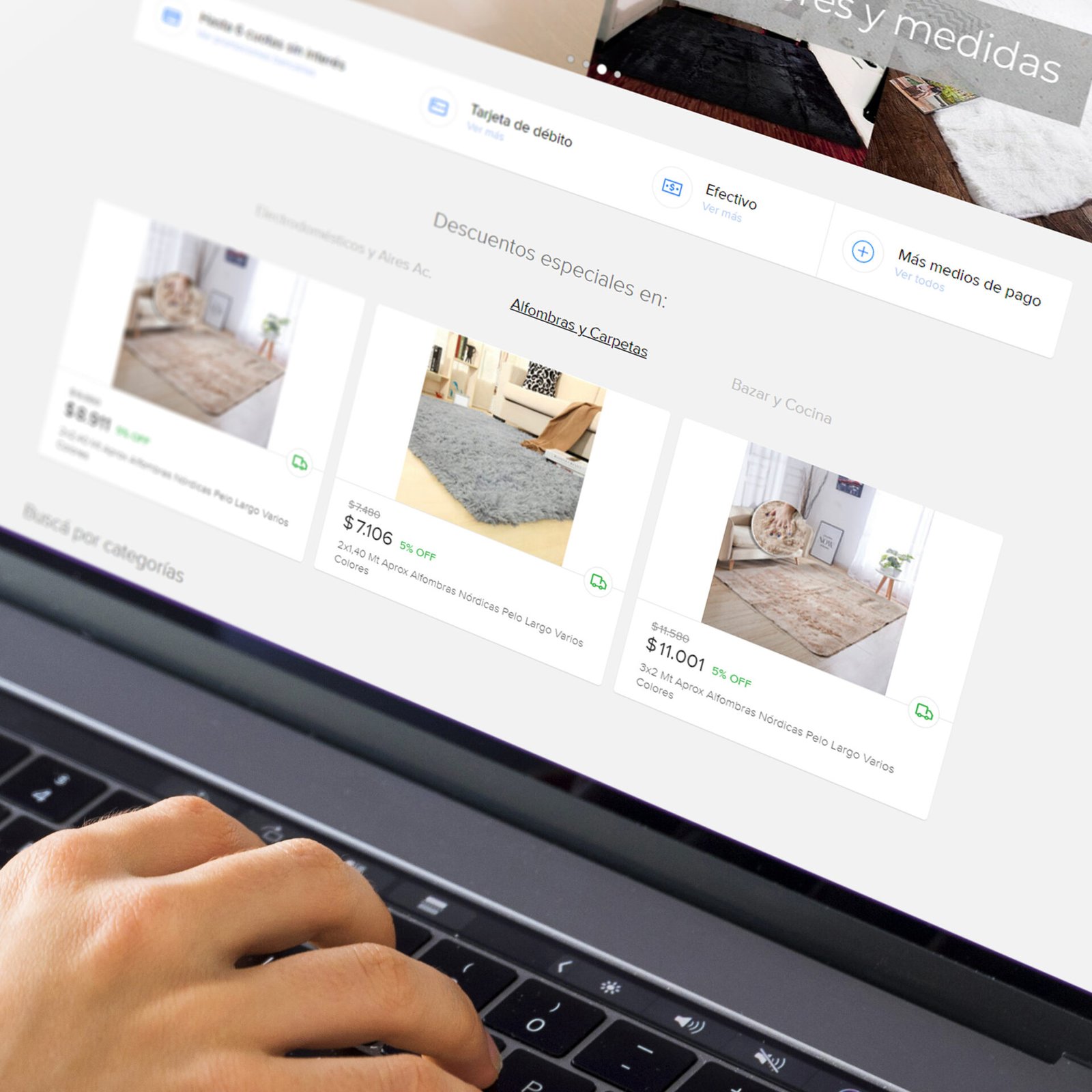
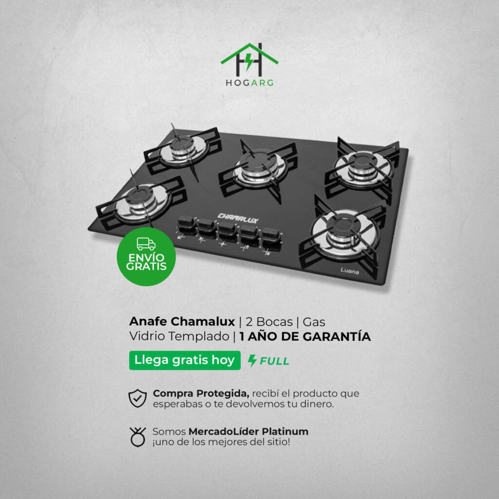
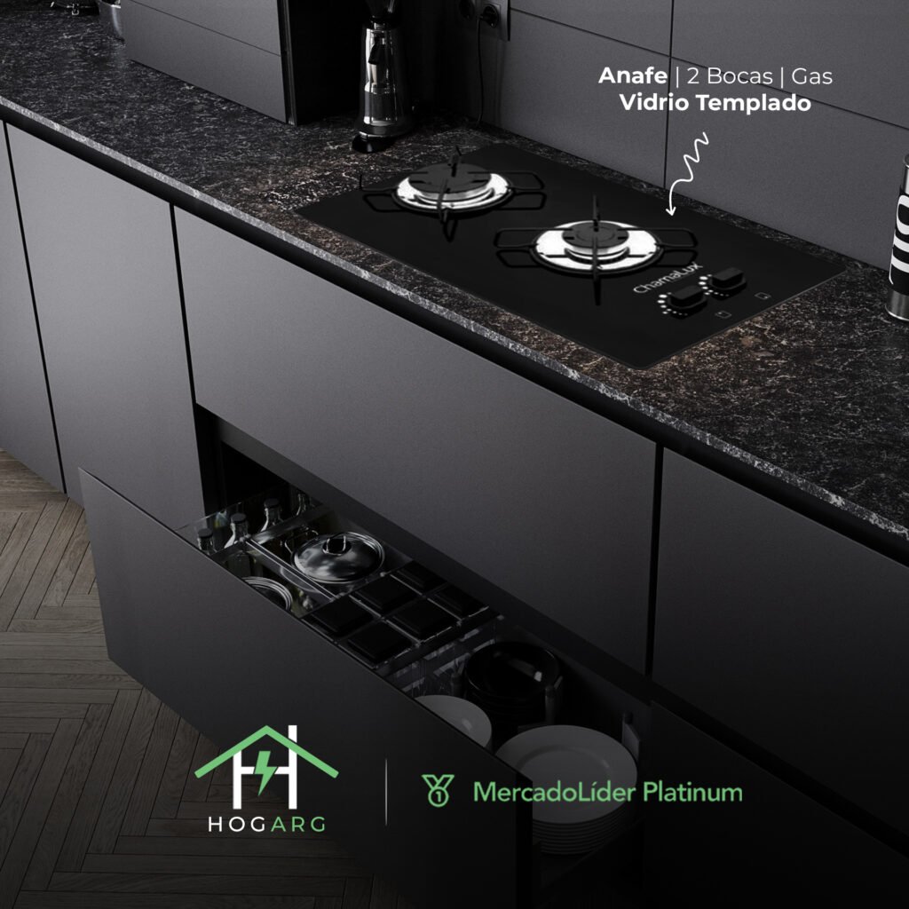
HogARG is an online store focused on home products, with a strong presence on MercadoLibre Argentina and a growing standalone website. The project involved developing the brand’s visual identity, ecommerce-focused design system, and digital layout optimization to enhance perception and drive conversions.

The visual approach is clean and modern, tailored to the ecommerce space, emphasizing trust, clarity, and a structured interface. The graphic system was applied to banners, product listings, headers, and key components on MercadoLibre, as well as across the desktop and mobile versions of hogarg.com.ar.

The result is a strong, recognizable, and scalable brand built for growth in a highly competitive digital market.

MercadoLíder Platinum

Montserrat Font

Aa Bb Cc Ee Ff Gg Hh Ii Jj Kk Ll

Mm Nn Oo Pp Qq Rr Ss Tt Uu Vv

Ww Xx Yy Zz 0 1 2 3 4 5 6 7 8 9 

#6DEAA5
109 | 234 | 165

#dadada
218 | 218 | 218

By Nico Sánchez

GuazuApp

Animation created to present GuazuApp, a tool developed in Misiones, Argentina, to centralize business communication through WhatsApp.

The goal was to explain clearly and visually how the app works, and how it helps teams stay connected, organized and efficient.
Graphic design, illustration and 2D animation in service of a practical idea born in the heart of Argentina.

By Nico Sánchez

GCENSA

GCENSA is an online store that brings together young, expressive brands with accessible pricing and unique style.
The project focused on building a clean, energetic, and flexible visual identity—ready to adapt across social media, web, and packaging without losing consistency.

The color system combines timeless black and white with a bold orange, adding vibrancy and youth to the visual language.
The Poppins type family adds elegance and readability, balancing perfectly with the brand mark.
The overall direction reflects a fresh, urban identity made to connect with a young audience eager to express themselves through fashion.

By Nico Sánchez

Legal Box Plus

Legal Box is a modern firm focused on redefining access to legal services. The project’s goal was to create a clear, trustworthy, and visually appealing website aligned with the brand’s minimalist and professional identity.

A clean visual approach was developed, with well-organized sections that make navigation intuitive and build trust from the first visit. The design emphasizes readability, mobile responsiveness, and a strong visual hierarchy to highlight key services.

The technical structure was also optimized for speed and SEO, giving Legal Box a solid and scalable digital presence.

By Nico Sánchez

A Piacere Restaurant

Located in the heart of Puerto Iguazú, A Piacere is a renowned restaurant that blends international cuisine with regional flavors from Misiones, Argentina. The objective was to develop an elegant and functional website that reflects the in-person dining experience.

The site was designed with a strong user-experience focus, showcasing high-quality visuals, intuitive navigation, and quick access to key features such as the menu, reservations, and location. The visual identity is refined and warm, using gourmet-inspired typography and a layout fully responsive across all devices.

In addition to the design, loading speed and SEO were optimized to ensure the restaurant’s online presence matches its reputation in the local gastronomic scene.

By Nico Sánchez

Video Editing

This project showcases a selection of travel videos produced for our YouTube channel, where I was responsible for the entire audiovisual process — from filming to final editing.

The content focuses on real-life experiences across different regions of Europe, blending tourism, culture, and lifestyle in a documentary style.
My role included camera and drone operation, editing, color correction, sound design, and narrative structuring.

Each video was crafted to convey authenticity and emotion, with a dynamic yet natural rhythm, tailored for digital audiences.
The goal was to create engaging and visually appealing content that inspires viewers to connect with each destination.

By Nico Sánchez